Kat Creech Events: Houston’s platinum wedding planner
|
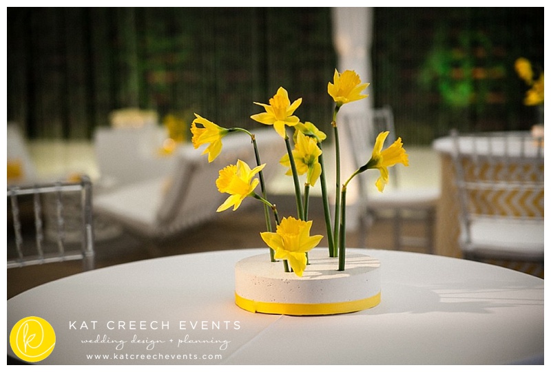
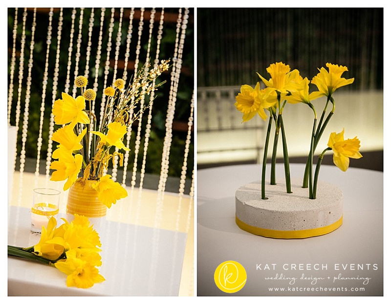
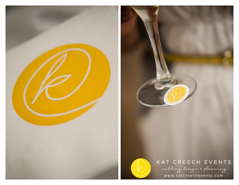
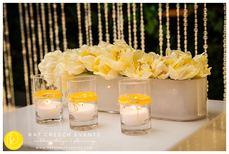
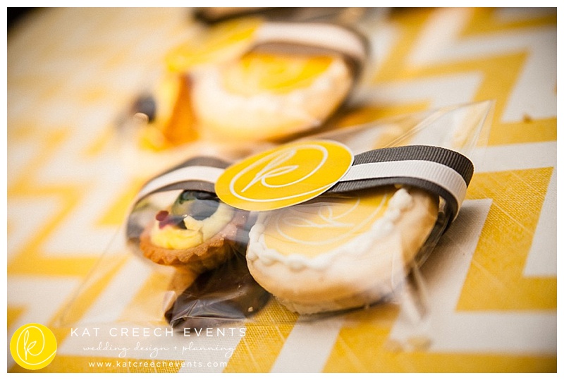
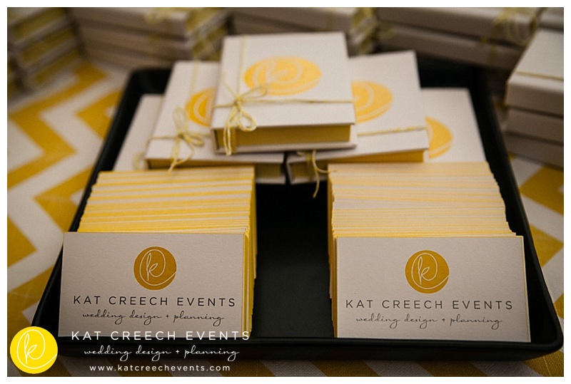
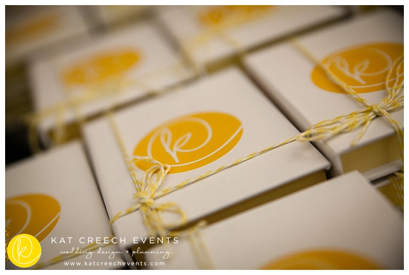
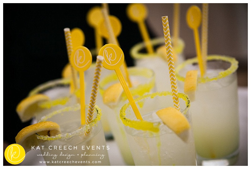
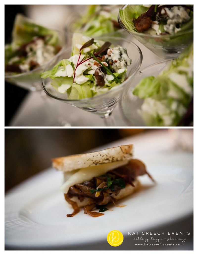
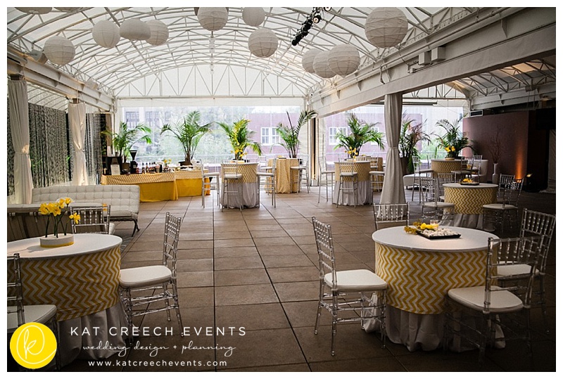
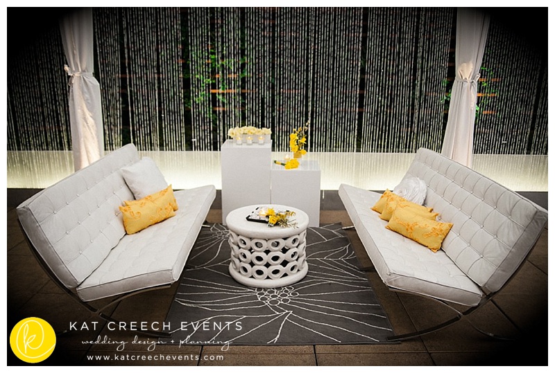
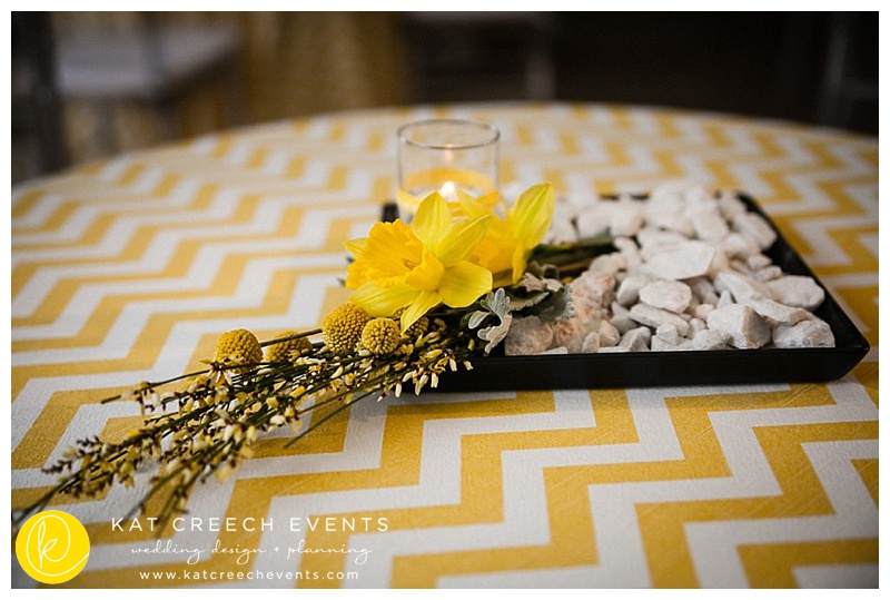
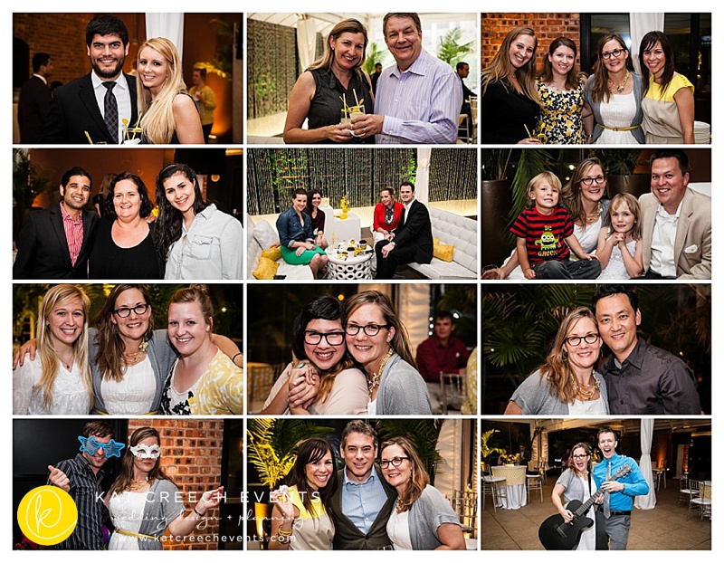
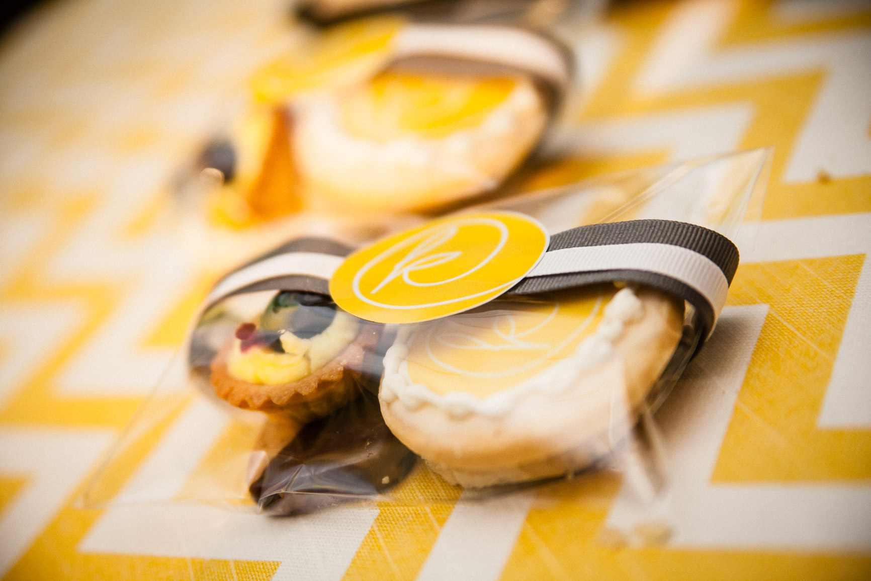
Branding and logos are essential to any successful business. You can look at any company, small or big, and know when you see an image that makes you feel good, you want to buy. It has an emotion and most times just makes you feel warm and fuzzy inside. Fashion logos are one of my favorite and all the good ones have an emblem to go along with their name. The great ones are simply recognized by the emblem alone as the name is no longer needed. Early on, before any us could read, we moved through the world with simple recognition of colors and emblems. Our former name Enjoy Events was a solid name. It was an action word to imply what we strive do every day of our lives. We have met many great clients, have been published, and have won national awards under that namesake. It has been good to us. But, the look and style of the logo and brand bothered me. Something just wasn’t right and I couldn’t quite put my finger on it. Then, it occurred to me. My vendors, industry peers, and clients were buying Kat Creech not Enjoy Events. My brand was also not resonating with what I do best, which is create a design, fresh and unique to my clients. My focus is not to do a the cookie-cutter wedding or event, but to do the extraordinary. I would look at my friendly competition and wonder when I would grow to have 6 or so event planners on the staff as I thought this would define success. I was making a number one mistake by comparing myself to others rather than looking at what my differential value was. I now stand by my mission statement that I am a boutique firm who designs weddings (events) for clients who want personality and style to their event, with timeless memories. As Houston’s platinum wedding planner, we will ensure that you will have more than a checklist, but a wedding experience that will lead to the best day of your life. This means we needed a logo and brand to resonate with this thought. With years of experience in the industry, having my name as the namesake of the company made a lot of sense. Sure, people approached me with the concern that have a personal business name is difficult for resale value. For those concerns, this is not part of my mission statement and when I become internationally known, this will not be a problem. Yes, my dreams are big and yes, they are attainable. The sketching started and the realization of my scribbled signature already had the makings of a great emblem, with lots of hidden meanings. The K with a long circular brush, which made into a C, also represented the @ sign, and is finished off with a little hidden leaf for my sustainable mission. I sent it off to my good friends at Delphine Press to fine tune the idea and assist with selecting the perfect color. As a designer my favorite color changes like the wind as I am consistently inspired daily, but yellow has always drawn me in. It has never been listed as my favorite color, but I can say that any time I am surrounded by yellow, I am happy. It just makes me feel good. Now, you should never pick your color brand by how you feel, but how your end user feels, so I called on some leading publishers and their insight was incredible and yellow is here to make you smile. So, smile on. To launch the brand, I do the only thing I know to do and that is to throw a party. The Sam Houston Hotel was a perfect canvas with it’s grey concrete floors and white veranda ceiling. While not a trained florist, I wanted to design a centerpiece that truly represented my style and not the adaptable person I am every weekend. Polished concrete bases with delicate daffodils is the perfect balance of heaven, for me. Then we branded everything from the cookies to the wine charms and to the napkins to the drink stirrers. Even my dear chef, made sure the made to order grilled cheeses were served in circles. Our industry friends left with what I would consider the most useful party favor ever, a posted note logo book. Cheers to a new look! Ingredients to achieving this look: KAT CREECH EVENTS: logo concept and event design DELPHINE PRESS: logo and business card design STEVE LEE PHOTOGRAPHY: photos SAM HOUSTON HOTEL: venue ELEGANT BEGINNINGS: linens ACOUSTIC PRODUCTIONS: music LG ENTERTAINERS: lighting MICHAEL’S COOKIE JAR: logo and assorted cookies SWIFT AND CO: lounge furniture TRENDY TOUCHES: photo booth
|